CLIENTS
Beni Hashim Arabians
PROJECTS
Arabic Calligraphy Logo
LOCATION
Jeddah, Saudi Arabia
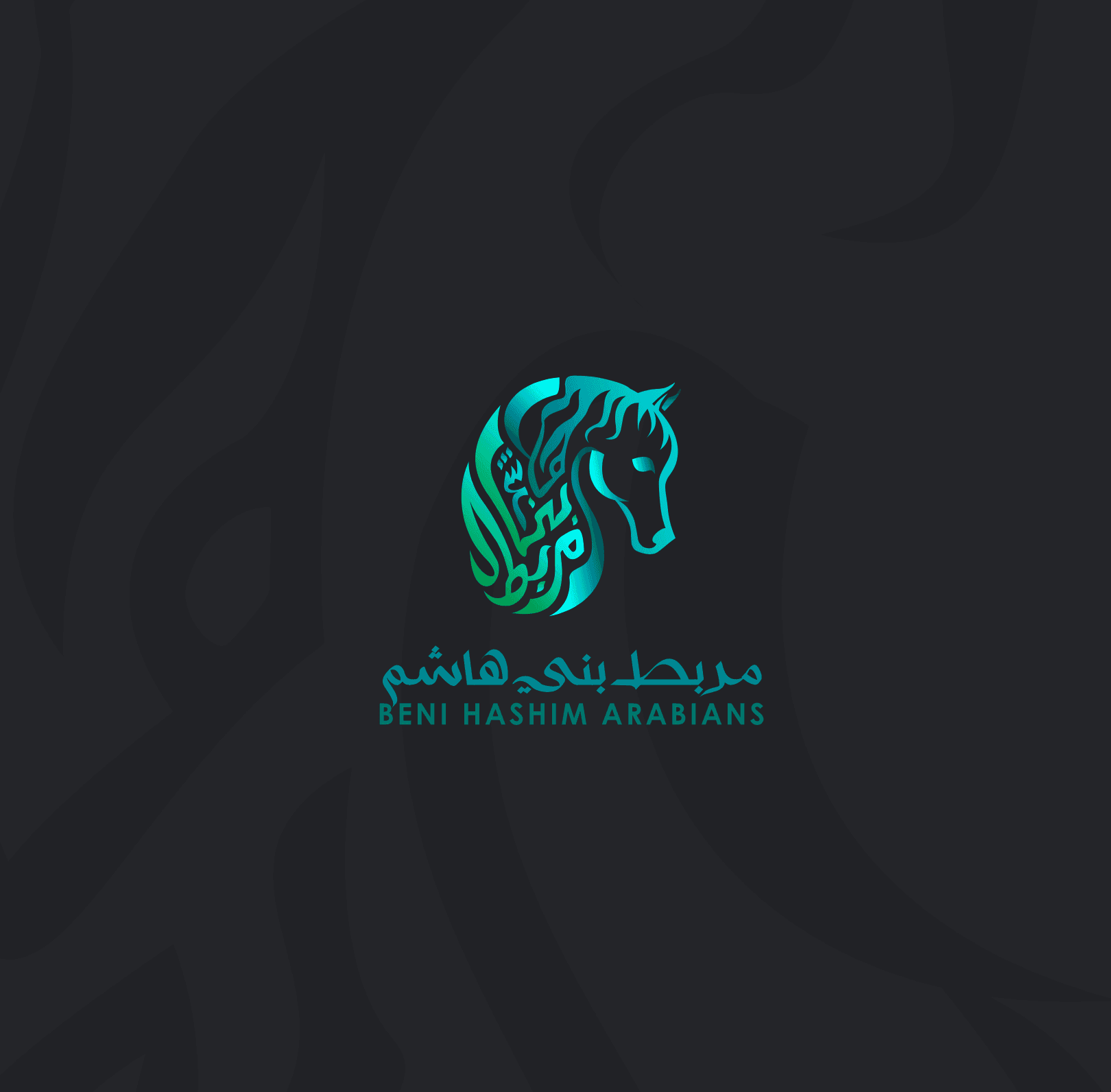
Logo Concept: Beni Hashim Arabians
The Design Philosophy
The visual identity is centered on a bespoke calligraphic mark that serves as both a linguistic and a representational icon. The design honors the nobility and grace inherent in the "Beni Hashim" name and the world of high-end equestrian breeding.
Core Visual Elements
Zoomorphic Calligraphy: The logo is a stunning example of zoomorphism, where the Arabic letters for "مربط بني هاشم" (Beni Hashim Stud) are meticulously woven to form the unmistakable silhouette of an Arabian horse.
The Arabian Profile: The calligraphy specifically mimics the refined features of an Arabian Arabian horse, including the arched neck and the proud, alert posture.
Fluidity of Script: The continuous, flowing lines of the Diwani-inspired script represent the speed, elegance, and pedigree of the horses within the stud.
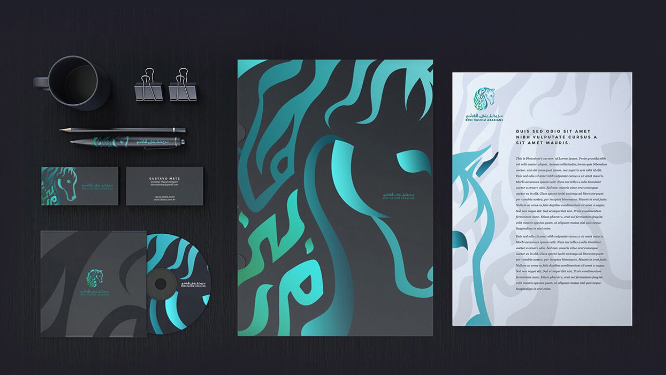
Identity & Visual System
Color Palette: The brand utilizes a classic, prestigious "Golden Sand" and "Ebony" contrast, reflecting the desert heritage and the luxury nature of the stud.
Typography: The calligraphic mark is paired with a clean, serif English typeface that provides a grounded, stable foundation to the intricate Arabic artistry.
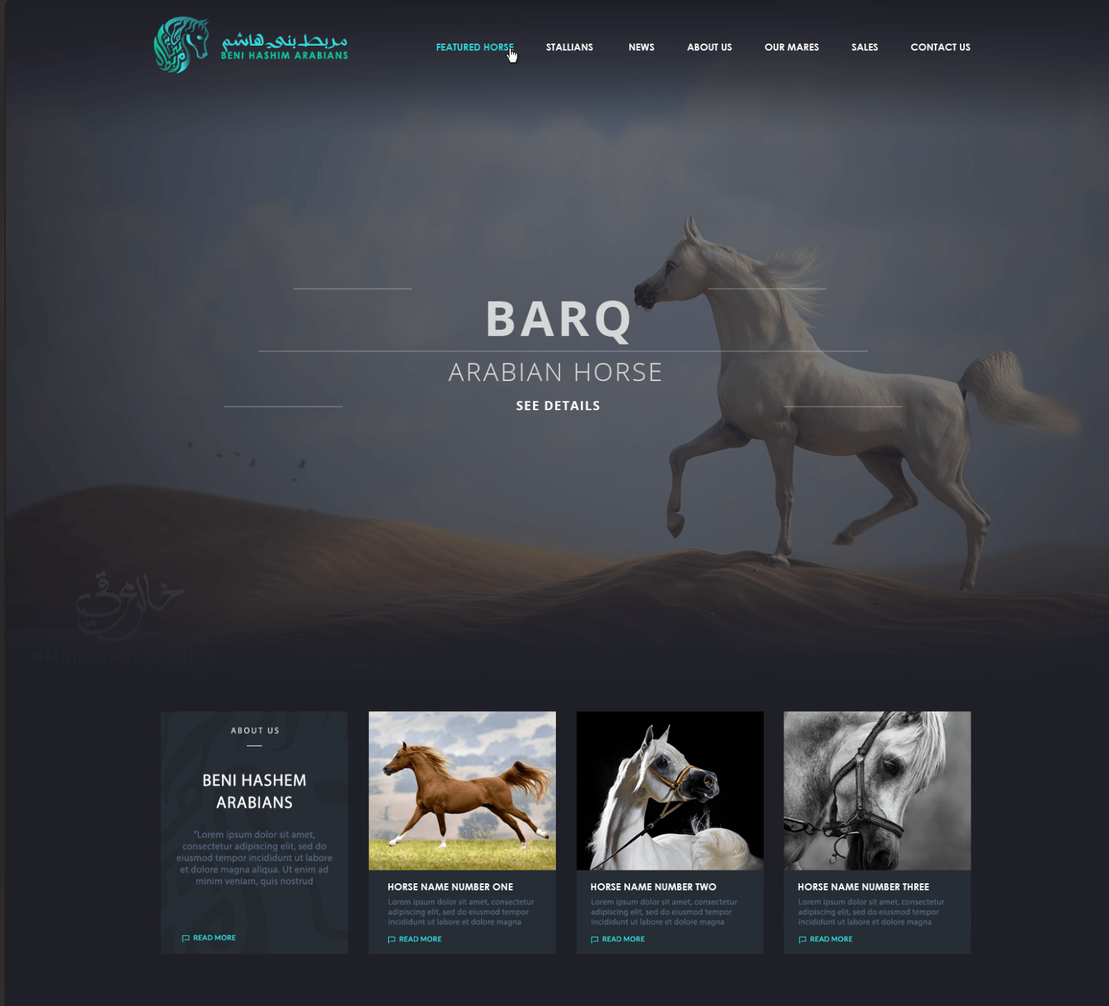
Premium Application: The identity is designed to transition seamlessly from digital platforms to physical luxury applications, such as embroidered equestrian gear, embossed stationery, and high-end signage.
UX Insight
From a UX perspective, this identity creates an immediate emotional connection by honoring traditional values through a modern lens. The dual-layered meaning—reading the name while seeing the horse—engages the viewer's intellect and appreciation for craft, instantly positioning the brand as a leader in its field.
