CLIENTS
ULUTY QATAR
PROJECTS
Logo Identity and Branding
LOCATION
Doha, Qatar
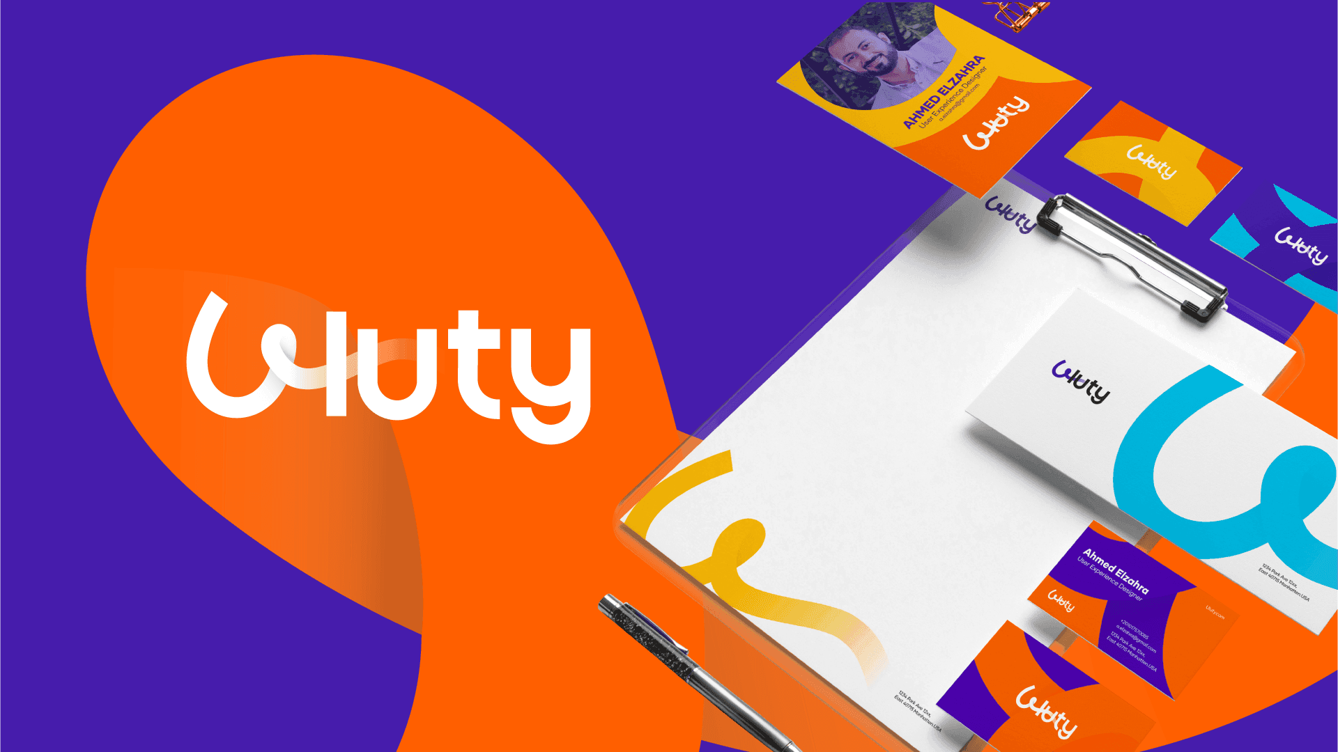
Logo Concept: Uluty
The Design Philosophy
The "Uluty" visual identity is built on the concept of High-Speed Connectivity. The mark is a minimalist geometric representation of an "electric pulse" or a "data signal," reflecting the brand's core as an electronics hub. By merging sharp angles with clean lines, the logo communicates a sense of technological efficiency and forward-thinking retail.


Core Visual Elements
Abstract "U" Integration: The central icon subtly incorporates a stylized letter "U," creating a unique and recognizable brand mark.
Signal Metaphor: The parallel lines and slanted edges evoke the look of a digital signal or a circuit board component, positioning the brand firmly within the tech industry.
Dynamic Motion: The italicized, right-leaning energy of the icon symbolizes rapid delivery and the fast-paced nature of the electronics market in Qatar.
Identity & Visual System
Color Palette: The brand utilizes a vibrant "Electric Cyan" and "Digital Blue" gradient, which signifies innovation and reliability. This is set against a deep navy background to maintain a premium, high-contrast look.
Typography: The wordmark features a bold, sans-serif font with clean, modern proportions to ensure high legibility across digital platforms and physical store signage.
Visual Continuity: The identity is applied consistently across stationery and retail assets, utilizing the signature gradient and geometric motifs to reinforce brand recognition.
UX Insight
From a UX perspective, the Uluty identity is designed for Digital Scalability. The simplicity of the icon ensures it remains clear and impactful on small mobile app icons, which is critical for a modern e-commerce experience. The high-contrast color scheme also aids in navigation, guiding the user’s eye toward key actions in a digital storefront.
